Plotting Model Quality Data
plots.RmdThere are a handful of plot types built into mqor(). To
demonstrate them, we first need to calculate some statistics to use as
inputs.
stats_long <- summarise_mqo_stats(demo_longterm, "PM10", term = "long")
#> ! Using fixed long-term annual pm10 parameters.
#> ℹ If this is incorrect, please use `mqor::mqo_params()` or
#>   `mqor::mqo_params_default()` to construct a parameter set.

stats_short <- summarise_mqo_stats(demo_shortterm, "PM10", term = "short")
#> ! Using fixed short-term daily pm10 parameters.
#> ℹ If this is incorrect, please use `mqor::mqo_params()` or
#>   `mqor::mqo_params_default()` to construct a parameter set.
Plot Types
‘Comparison’ Bars
To visualise measurement data directly, it can be useful to start
with plot_comparison_bars().
For long-term data, this draws a bar chart of both observed and modelled values, with an ‘acceptability range’ (AR) drawn for the observation bars. Modelled values meeting MQI[long] <= 1 for a particular sampling point are within the corresponding observed value’s AR.
plot_comparison_bars(stats_long)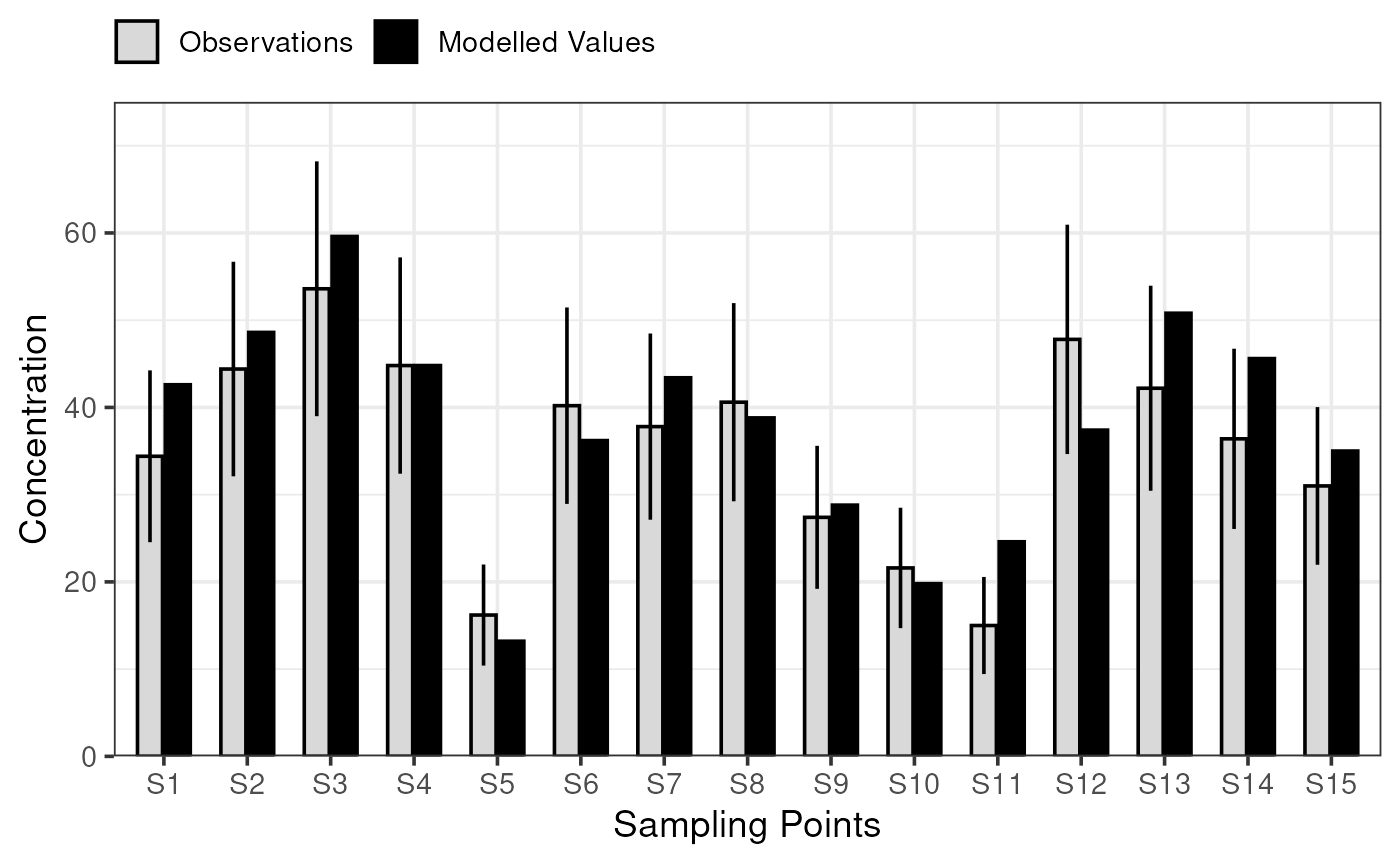
For short-term data, plot_comparison_bars() shows RMSU
multiplied by the square root of 1 + beta squared and RMSE.
plot_comparison_bars(stats_short)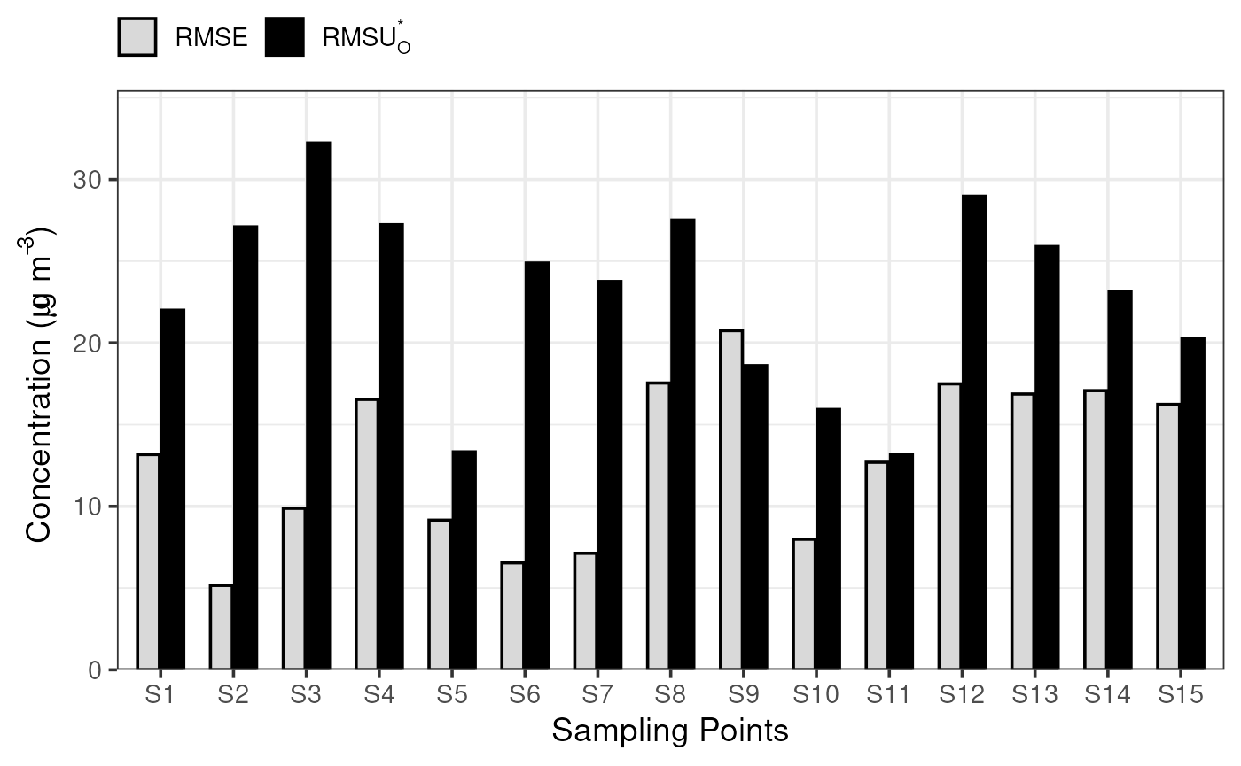
You will likely notice that both statistics objects are fed into the same function; the function is intelligent enough to understand if the stats are for short- or long-term data, and choose appropriate statistics to visualise.
Model Quality Bars
To actually apply the MQO, plot_mqi_bars() will create
an ordered bar chart showing the MQI for each sampling point. The dashed
horizontal line shows the MQI[90th]. These plots are very similar
regardless of whether the short- or long-term statistics are of
interest.
plot_mqi_bars(stats_long)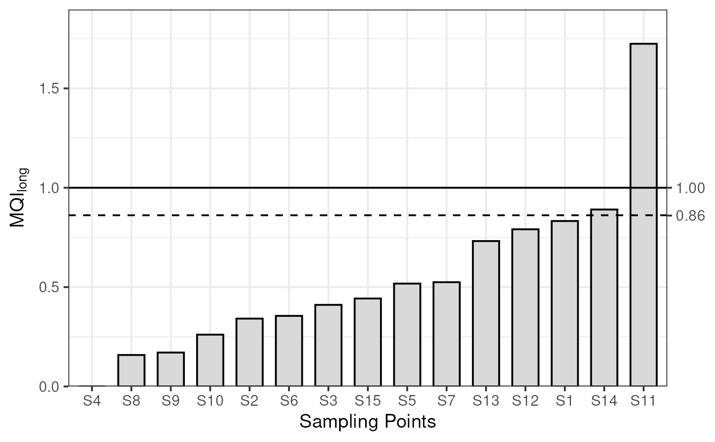
plot_mqi_bars(stats_short)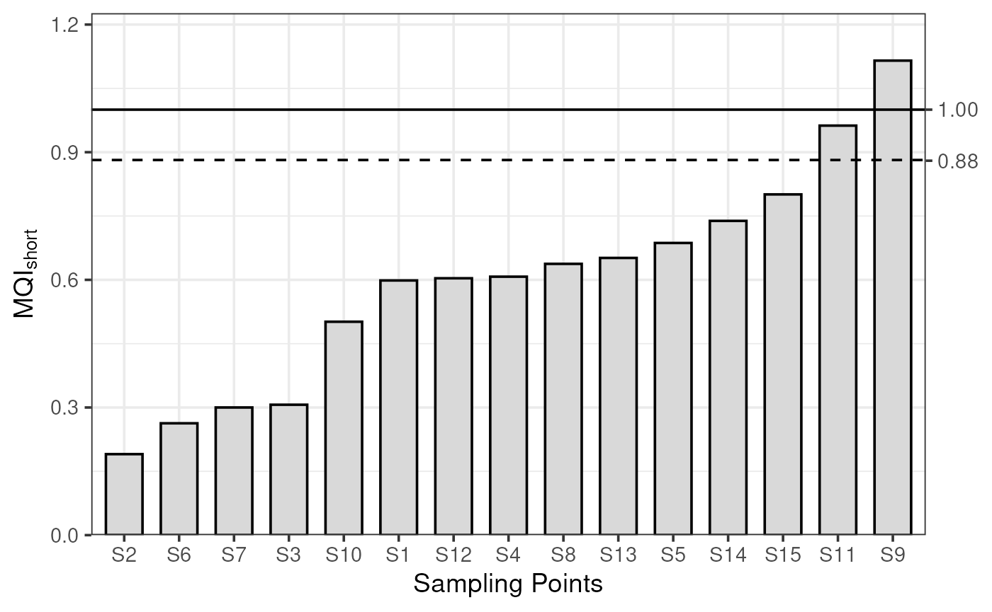
Model Quality Scatter
For large numbers of sites, a complementary ‘scatter’ chart can be useful as a bar chart will grow more crowded.
For long-term data, plot_mqi_scatter() shows a scatter
of modelled and observed concentrations, with the AR as a shaded
area.
plot_mqi_scatter(stats_long)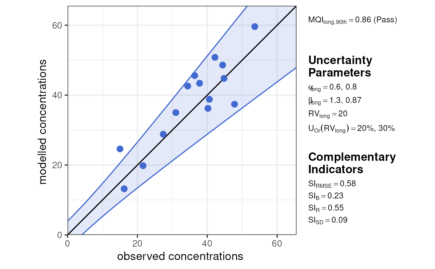
For short-term data, plot_mqi_scatter() shows a special
‘target’ diagram. If both sets of stats are provided, the target diagram
also labels MQI long.
plot_mqi_scatter(stats_short, stats_long)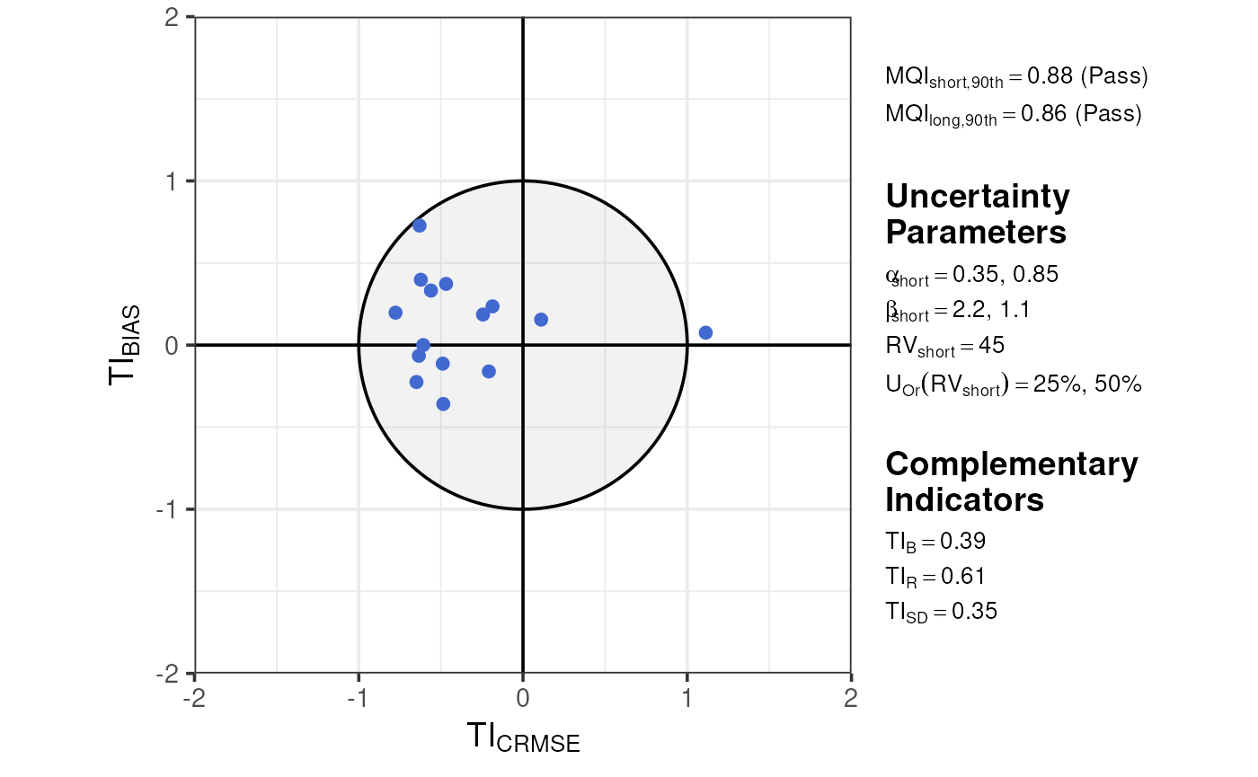
These plots vary somewhat for ‘mixed’ networks of both fixed and indicative sites, incorporating colour to show both acceptability ranges on one plot.
demo_longterm |>
  dplyr::mutate(
    type = c(rep("fixed", 10), rep("indicative", 5))
  ) |>
  summarise_mqo_stats("PM10") |>
  plot_mqi_scatter()
#> ! term assumed to be 'long'.
#> ℹ If this is incorrect, please specify the data's term using the term argument.
#> ! Using fixed long-term annual pm10 parameters.
#> ℹ If this is incorrect, please use `mqor::mqo_params()` or
#>   `mqor::mqo_params_default()` to construct a parameter set.
#> ! Using indicative long-term annual pm10 parameters.
#> ℹ If this is incorrect, please use `mqor::mqo_params()` or
#>   `mqor::mqo_params_default()` to construct a parameter set.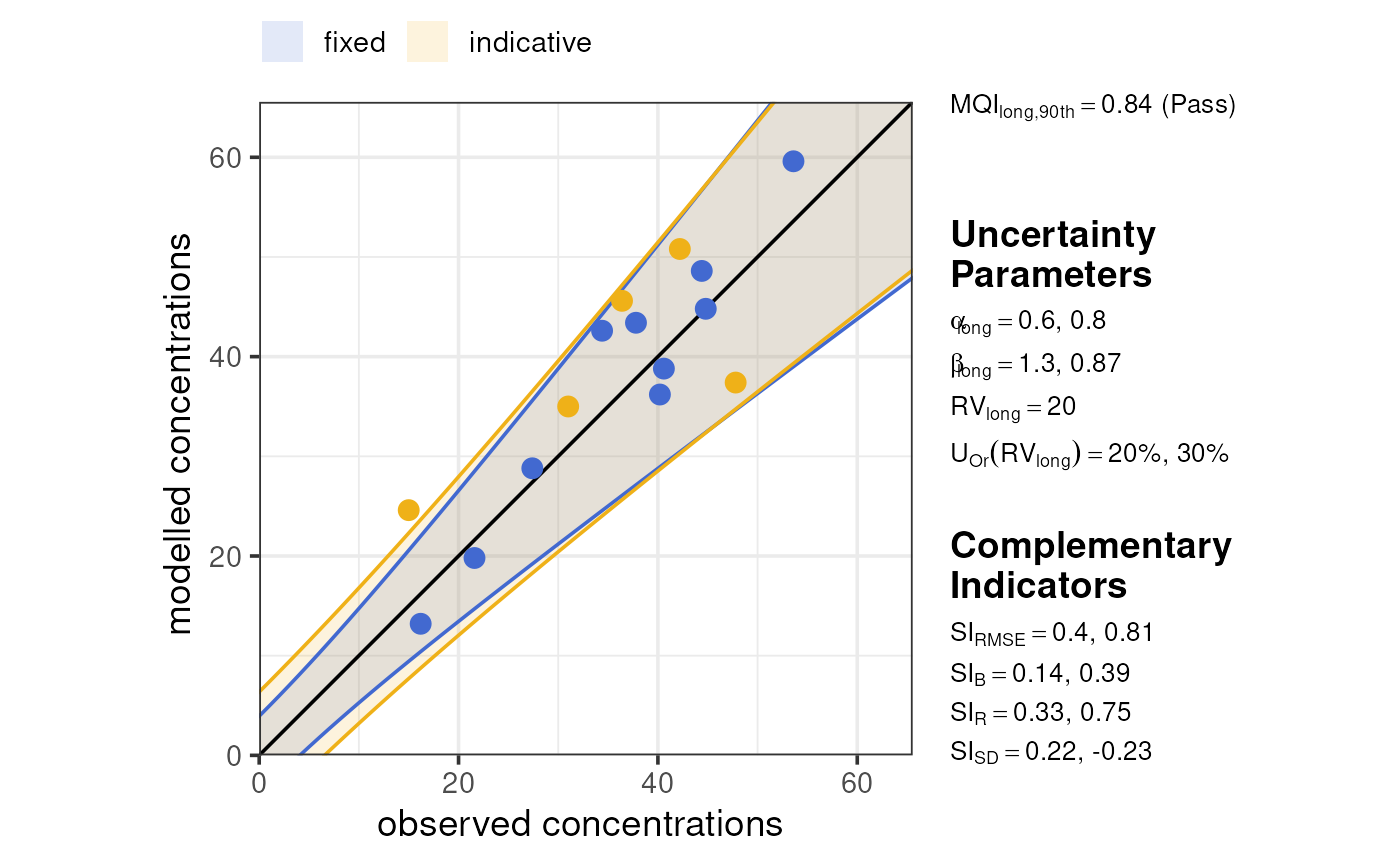
demo_shortterm |>
  dplyr::mutate(
    type = c(rep("fixed", 50), rep("indicative", 25))
  ) |>
  summarise_mqo_stats("PM10") |>
  plot_mqi_scatter()
#> ! term assumed to be 'short'.
#> ℹ If this is incorrect, please specify the data's term using the term argument.
#> ! Using fixed short-term daily pm10 parameters.
#> ℹ If this is incorrect, please use `mqor::mqo_params()` or
#>   `mqor::mqo_params_default()` to construct a parameter set.
#> ! Using indicative short-term daily pm10 parameters.
#> ℹ If this is incorrect, please use `mqor::mqo_params()` or
#>   `mqor::mqo_params_default()` to construct a parameter set.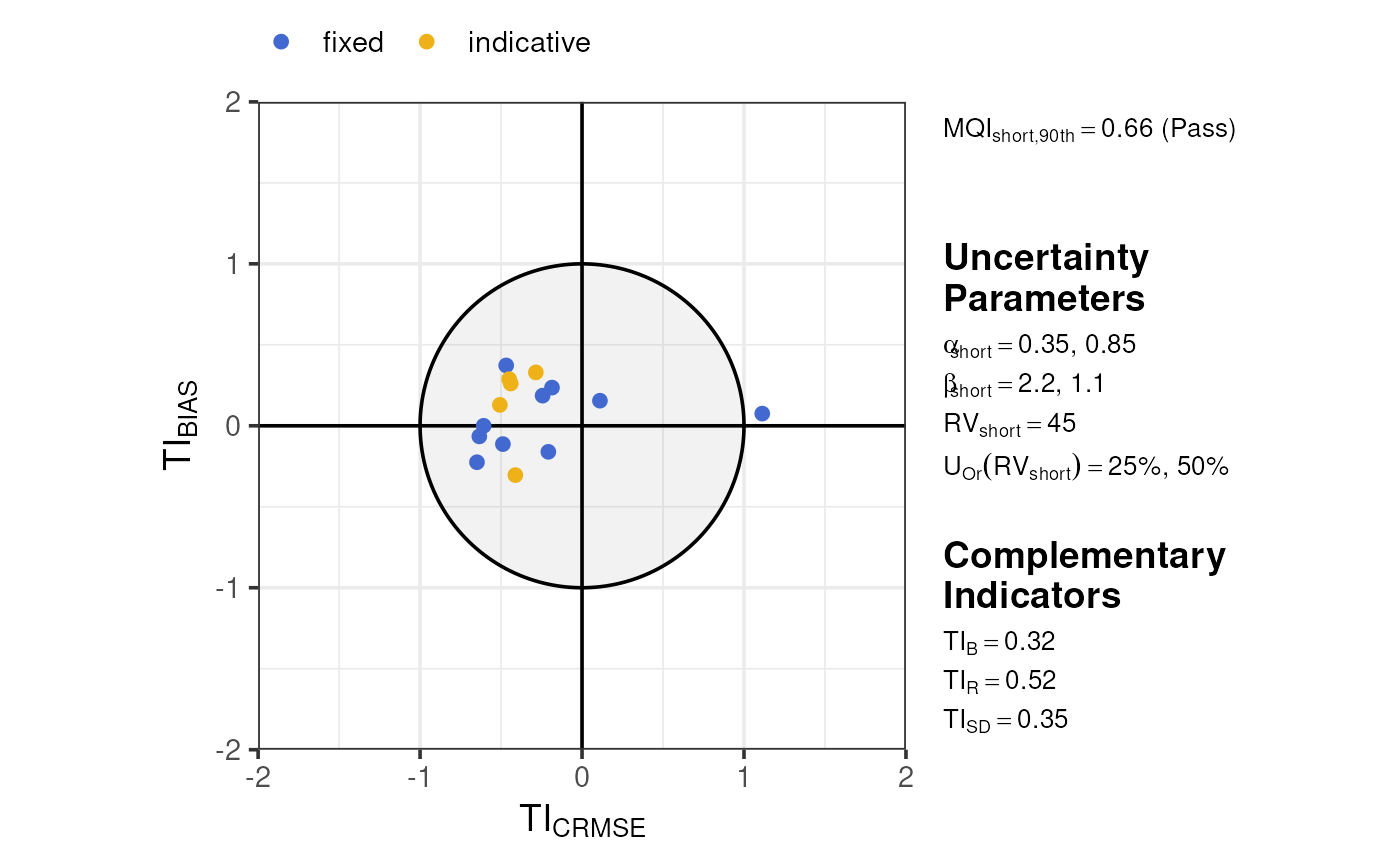
Model Quality Report
Both short- and long-term statistics can be viewed simultaneously in the MQI “report” format, which shows both the short- and long-term MQI as well as all complementary indicators. Much like the MQI scatter plots, this plot distinguishes between fixed and indicative sites.
plot_mqi_report(stats_short, stats_long)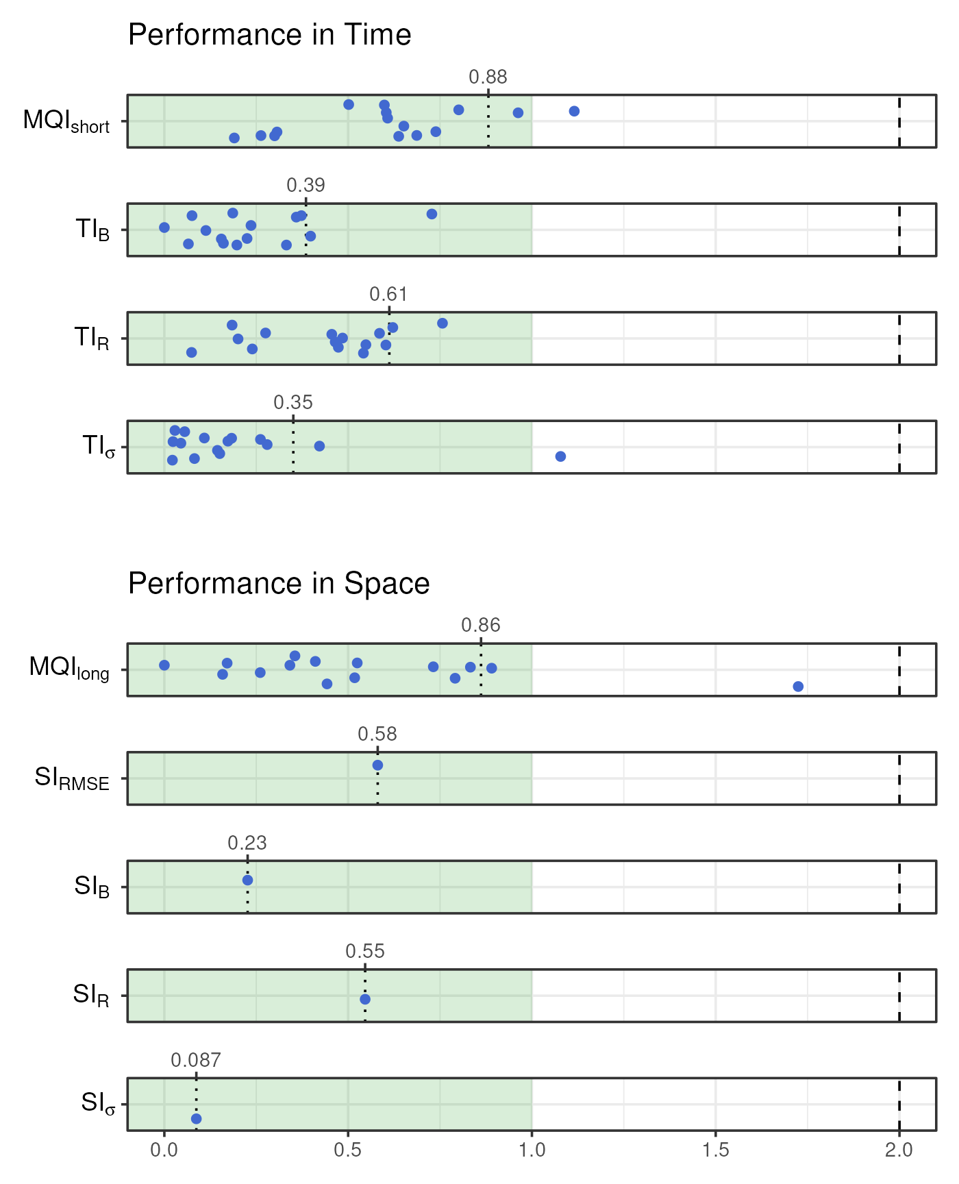
Customisation
All of the MQI plotting functions in mqor contain the
show_annotations argument, which adds parameter and
indicator annotations. This defaults to TRUE in
plot_mqi_scatter() and FALSE in all other
plotting functions.
plot_comparison_bars(stats_short, show_annotations = TRUE)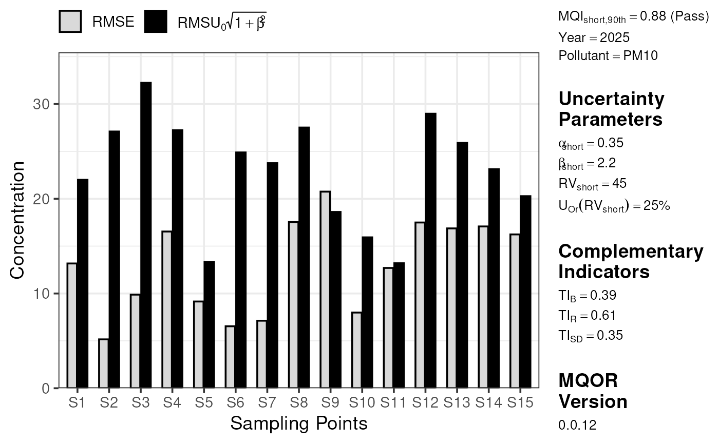
Users have some basic control over the colours used in each plot.
These arguments always start with color_ and take either R
colour names or hex codes.
plot_comparison_bars(
  stats_long,
  color_mod = "#003776",
  color_obs = "#F8AE21",
  color_outline = "#404040"
)
The static plots are built using ggplot2, a highly capable and customisable plotting language. A particular strength of ggplot2 is its allowance for post-hoc customisations. If you aren’t familiar with ggplot2, please refer to https://ggplot2-book.org/ for guidance from its authors. The below code chunk demonstrates a few options available to users, including changing the plot theme, axis scales, annotations, and so on.
plot_comparison_bars(stats_short, color_outline = "white") +
  # add a new theme
  ggplot2::theme_dark() +
  ggplot2::theme(legend.position = "bottom") +
  # change labels
  ggplot2::labs(x = "Monitoring Sites", fill = "Statistic") +
  # change y scale
  ggplot2::scale_y_continuous(limits = c(0, 40)) +
  # add an annotation
  ggplot2::annotate(
    x = "S11",
    y = 20,
    geom = "text",
    color = "white",
    label = "Look\nat this!"
  ) +
  ggplot2::annotate(
    x = "S11",
    xend = "S11",
    y = 17.5,
    yend = 14,
    geom = "segment",
    color = "white",
    arrow = ggplot2::arrow(length = ggplot2::unit(0.25, "cm"))
  )
#> Scale for y is already present.
#> Adding another scale for y, which will replace the existing scale.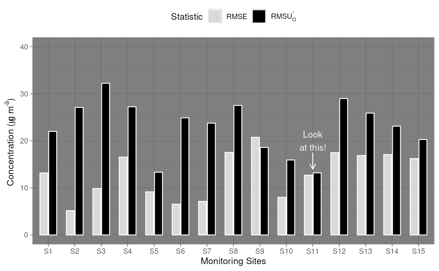
For complete customisation, users are naturally free to re-plot the summary statistics in any way they find useful. ggplot2 is a good candidate for this, but users can choose to use base R plotting, a different plotting library, a JavaScript wrapper like plotly or echarts4r, or even export the statistics tables for use in other software like Excel or Python.
library(ggplot2)

summarise_mqo_stats(demo_shortterm, pollutant = "PM10")$by_site |>
  ggplot(aes(x = mean_obs, y = mean_mod)) +
  geom_smooth(method = "lm") +
  geom_pointrange(aes(ymin = mean_mod - sd_mod, ymax = mean_mod + sd_mod), alpha = 0.5) +
  geom_pointrange(aes(xmin = mean_obs - sd_obs, xmax = mean_obs + sd_obs), alpha = 0.5) +
  coord_fixed() +
  theme_bw() +
  labs(
    x = "Observed Values",
    y = "Modelled Values"
  )
#> ! term assumed to be 'short'.
#> ℹ If this is incorrect, please specify the data's term using the term argument.
#> ! Using fixed short-term daily pm10 parameters.
#> ℹ If this is incorrect, please use `mqor::mqo_params()` or
#>   `mqor::mqo_params_default()` to construct a parameter set.
#> `geom_smooth()` using formula = 'y ~ x'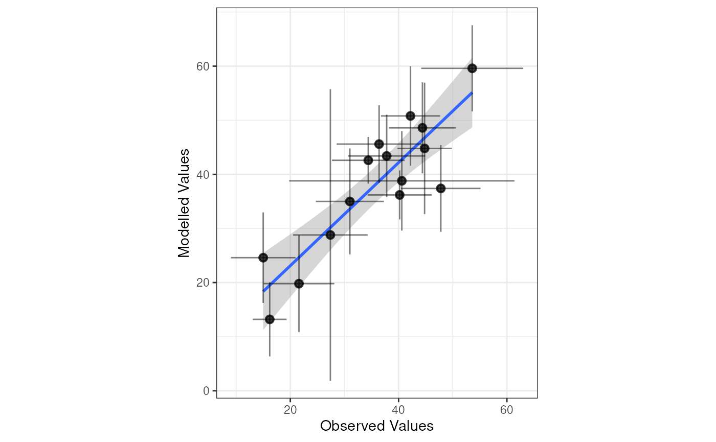
Dynamic Plots
Each of the plotting functions has an interactive
argument. When TRUE, the JavaScript library
plotly is used to produce a dynamic chart. These outputs
are naturally inappropriate to include in a typical PDF report, but are
better suited for web applications, Quarto or rmarkdown
dynamic reports, or exploratory analysis.
plot_comparison_bars(stats_long, interactive = TRUE)
plot_mqi_bars(stats_long, interactive = TRUE)
plot_mqi_scatter(stats_long, interactive = TRUE)
plot_mqi_scatter(stats_short, stats_long, interactive = TRUE)
plot_mqi_report(stats_short, stats_long, interactive = TRUE)