Plot a bar chart comparing observed (measured) and modelled concentrations
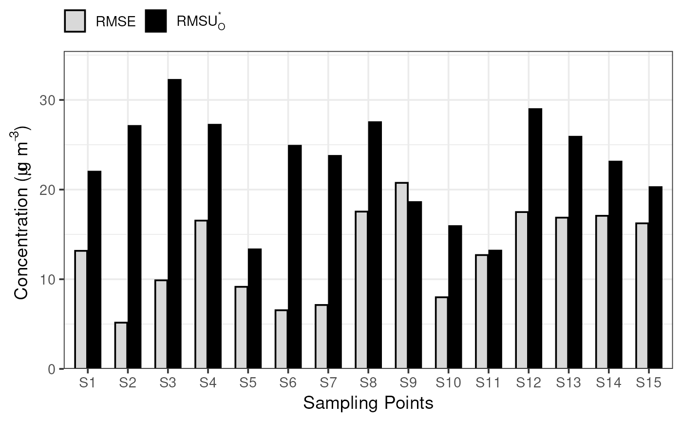
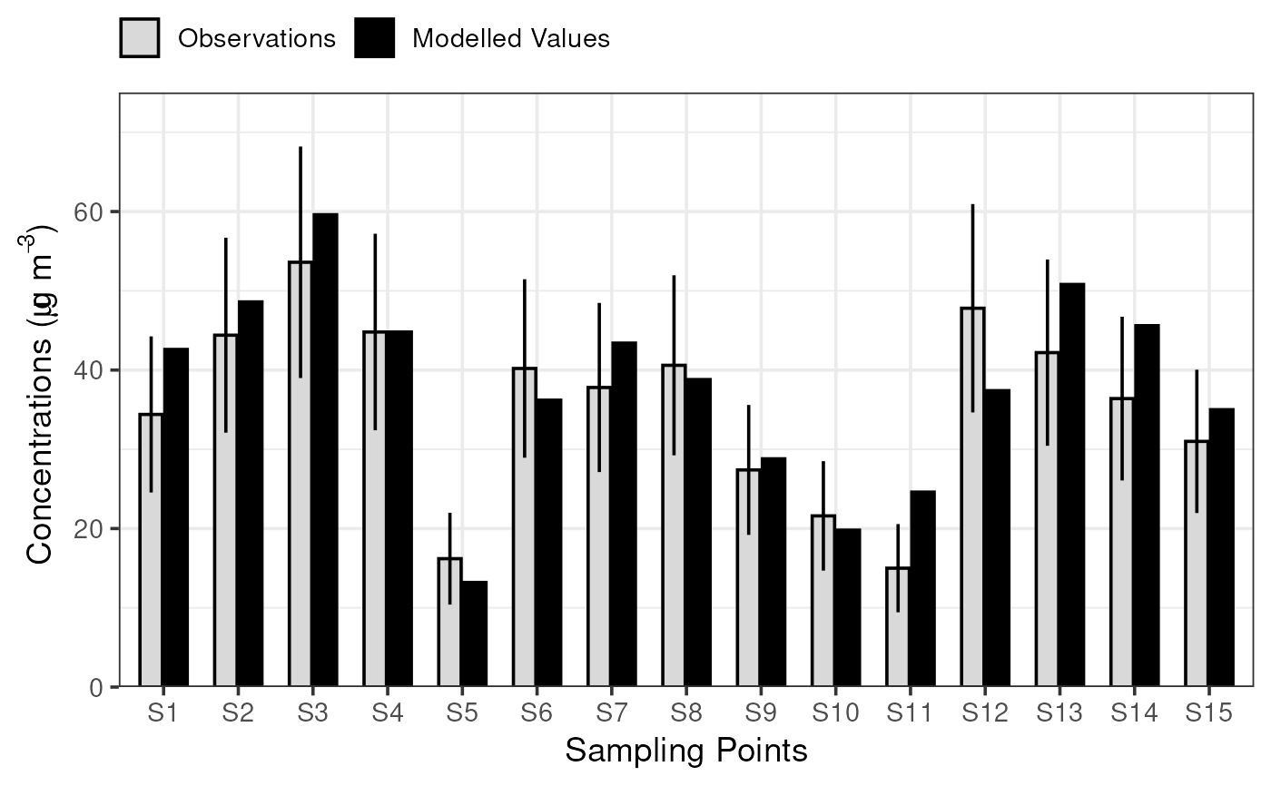
plot_comparison_bars.RdThis function produces a plot comparing modelled and measured concentrations. For long-term data, the provided annual averaged measured data is visualised alongside the performance acceptability range of the observations. For short-term data, the RMSE and RMSU*0 are visualised.
Usage
plot_comparison_bars(
  stats,
  stats2 = NULL,
  color_obs = "grey85",
  color_mod = "black",
  color_outline = "black",
  show_annotations = FALSE,
  title = NULL,
  interactive = FALSE,
  gp = grid::gpar(fontsize = 10)
)
Arguments
- stats, stats2
The output of
summarise_mqo_stats(). All relevant information (e.g.,term,params_fixed, etc.) will be passed to this function from the statistics object.statsis compulsory andstats2optional. If both are provided,statsandstats2should be different terms (one short and one long). In that case, short-term stats are plotted preferentially but the long-term stats will be annotated ifshow_annotations = TRUE.- color_obs, color_mod, color_outline
The colours to use to fill the 'observation' bars, 'modelled' bars, and for the outlines/error bars. Can be expressed as hex codes, or any colours listed in
colors().- show_annotations
Should the figure be annotated with input parameters and complementary performance indicators? These are useful extra detail, but can overcrowd the plotting area.
- title
An optional title for the plot. This will appear directly above the plot area, regardless of whether
interactiveisTRUEorFALSE.- interactive
If
FALSE, the default, a staticggplot2graphic will be returned which can be saved as a PNG, SVG, or other similar format. IfTRUE, a dynamic HTML widget will be returned created byplotly.- gp
A
grid::gpar()object passed togrid::textGrob(), used to control the appearance of the parameter & indicator annotations whenshow_annotations = TRUE.fontsizeis likely the most useful argument, but many options are available throughgrid::gpar(). Only thefontsizeargument is used wheninteractive = TRUE.
See also
Other plotting functions:
plot_mqi_bars(),
plot_mqi_report(),
plot_mqi_scatter(),
plot_timeseries()
Examples
plot_comparison_bars(
  summarise_mqo_stats(demo_longterm, pollutant = "PM10")
)
#> ! term assumed to be 'long'.
#> ℹ If this is incorrect, please specify the data's term using the term argument.
#>
#> ! Using fixed long-term annual pm10 parameters.
#> ℹ If this is incorrect, please use `mqor::mqo_params()` or
#>   `mqor::mqo_params_default()` to construct a parameter set.
#>


plot_comparison_bars(
  summarise_mqo_stats(demo_shortterm, pollutant = "PM10")
)
#> ! term assumed to be 'short'.
#> ℹ If this is incorrect, please specify the data's term using the term argument.
#>
#> ! Using fixed short-term daily pm10 parameters.
#> ℹ If this is incorrect, please use `mqor::mqo_params()` or
#>   `mqor::mqo_params_default()` to construct a parameter set.
#>
plot_comparison_bars(
summarise_mqo_stats(demo_shortterm, pollutant = "PM10")
)
#> ! term assumed to be 'short'.
#> ℹ If this is incorrect, please specify the data's term using the term argument.
#>
#> ! Using fixed short-term daily pm10 parameters.
#> ℹ If this is incorrect, please use `mqor::mqo_params()` or
#> `mqor::mqo_params_default()` to construct a parameter set.
#>